

A designer explains the many influences that determine how paint colours look in rooms and how to select the right ones for your home.

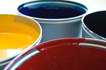
A strange thing happens when we take colour samples home from a paint shop. The shade that looked perfect in the store may look all wrong in the living room or den.
It’s because of the particular light conditions in a space, says West Island designer/stager Gabrielle Grawey. And, she adds, the light is not static; it shifts throughout the day.
“When I moved into my condo, I chose a neutral grey,” says Ms. Grawey, who owns the eponymously named Gabrielle Grawey Design. “However, in my bedroom, I have a patio door that admits a lot of light. The light changed the colour in that room, giving it a mauve tone. So I used that grey in the rest of the condo, but a different tone in the bedroom.”

Choosing the right paint colour should not be rushed, she says. The best way to buy colours to suit your home and your taste is to observe paint samples in various areas of your home at various times. Here is this designer’s advice to help you get the perfect hues:
- Check the paint sample against every wall of the room you plan to paint.
- Do this at various hours of the day and evening.
- Choose the colour in daylight for a truer sense of its components.
- Decide on the value of colour you want: pale, medium or dark. “What effect do you want the colour to have?” Ms. Grawey says.
- Place the paint sample beside something white, such as a doorframe, for a sense of contrast.
- If you’re planning to paint a bedroom, look at the colours in your bedding. “You can use that as a jumping-off point for the colour you want on your walls,” she says. “This creates cohesion.”
- Consider the colours and textures in your home’s other rooms to ensure there is flow between the spaces.
- Do not paint any walls or ceilings black. “It has a dark psychological effect,” she says.
- Do not ”put one colour on one wall and a different colour on an adjacent wall,” Ms. Grawey advises. “It creates a choppy effect.”
- Consider the level of colour saturation your paint will confer “so it doesn’t compete with your artwork,” she says. If you display art, use a muted or neutral colour on the walls. “You want your art to be the star.”
- Choose colours that “you’re drawn to,” she says. “Think about how you want to feel in your home and choose the colours that will inspire those feelings.”
Gabrielle Grawey is a stager and designer. www.gabriellegrawey.com — 514-501-9574 — gaby@GabrielleGrawey.com


